Is Link in Bio Harming Your Conversion?
I used a lot of link in bio tools for my social media. Then I noticed something that bothered me: my conversion dropped.
People were clicking through from my posts, so the interest was there. They just weren't doing anything once they arrived. I was determined to find out what had happened.
So I started talking to creators and business owners about their link in bio pages. Almost every one of them had the same problem. Visitors showed up and left without tapping a single link. That's when I decided to solve it, using what I'd learned from 20 years in SaaS products and conversion funnels.
Here is the short answer. Yes, a link in bio can hurt your conversion. When a visitor lands on a page of ten identical buttons, they have to guess which one matters, and guessing visitors often leave without tapping anything. The fix is not fewer links. It is a page that shows one main action first and ranks everything else behind it.
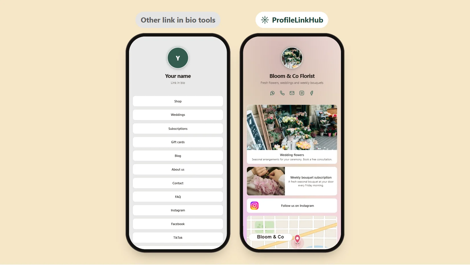
Same business, same links. The page on the left leaves visitors confused. The page on the right presents choices clearly.
Why a Link in Bio Page Can Lose You Clicks
A link in bio exists to solve one problem: Instagram, TikTok, X and LinkedIn give you room for a single link. So you put a page behind it that holds all your links. That is a good idea. What goes wrong is what most tools do next, which is stack your links in one flat list of identical buttons.
Think about who is on the other end. Someone tapped your link from a post, usually on a phone, usually with a few seconds of attention. They arrive with one question: "What do I do here?" A flat list answers it with another question: "Which of these ten?"
Designers have a name for this cost: the more equal choices you show, the longer a person takes to choose, and the more likely they are to choose nothing. It is known as Hick's Law, and it is one of the oldest rules in conversion design. A link in bio page is where it bites hardest, because the visitor is already one step removed from where they started.
Five Ways a Link in Bio Page Confuses Visitors
These are the patterns I kept running into, on my own pages and on the ones other people showed me.
1. Every link looks the same
When "Book a call", "Read my blog" and "Follow me on TikTok" are the same white bar, the visitor has no way to tell the thing that makes you money from the thing that doesn't. The most important link gets the same attention as the least.
2. There is no main action
A page with ten links has ten goals, which means it has none. If you cannot say in one sentence what a visitor should do first, neither can the page.
3. Link names say nothing
Names like "Click here", "Resources" or "My stuff" tell a visitor nothing. They have to tap to find out, and most won't.
4. Nothing looks like what it is
A shop, a booking page, a podcast and a map to your store all deserve a different look. When they are all text on a bar, the visitor cannot scan the page. They have to read it, and people on a phone don't read, they scan.
5. The page is out of date
Old offers, dead links and a launch from six months ago send visitors to a dead end. Every wasted tap makes the next one less likely.
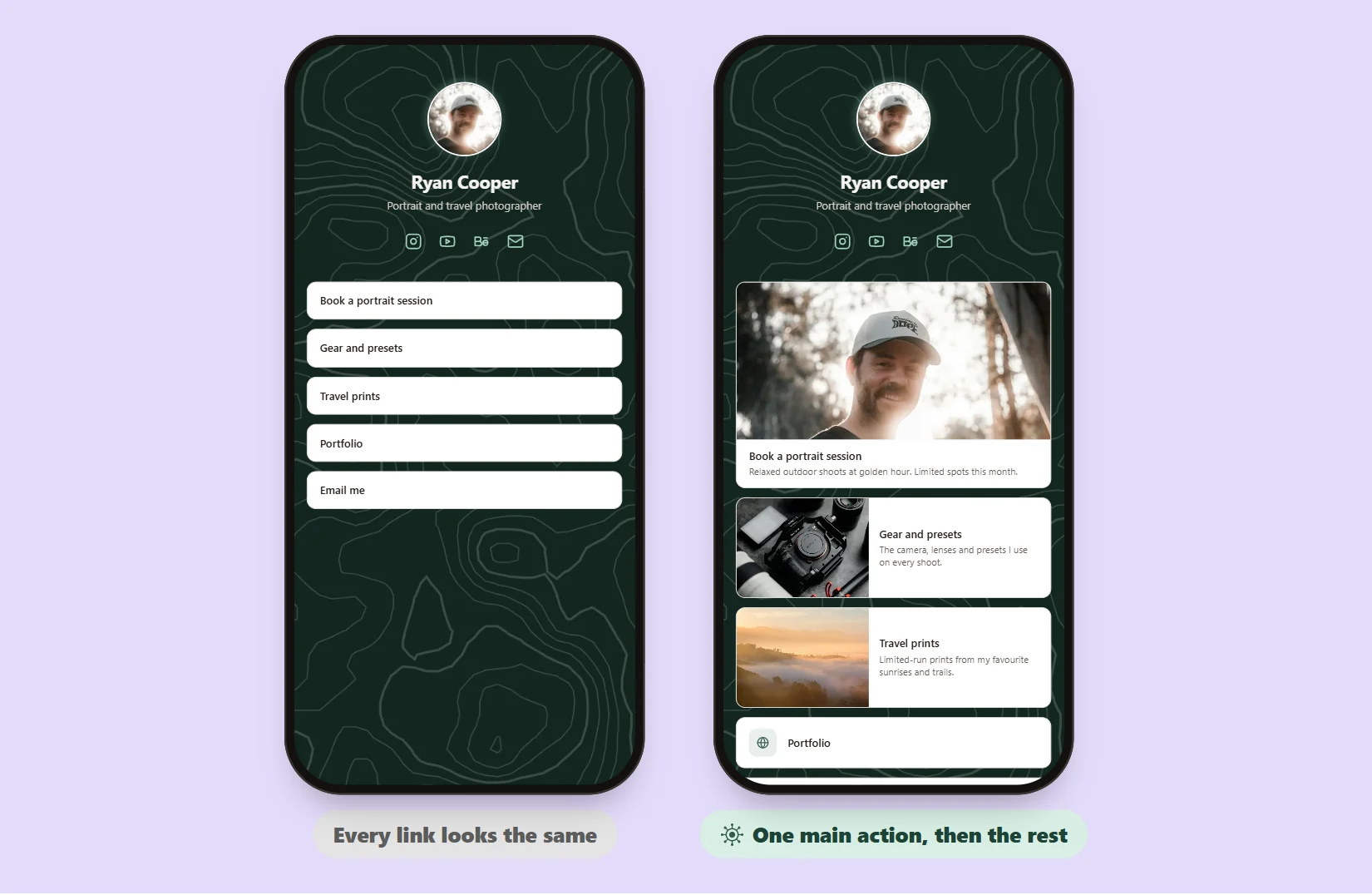
The same five links. On the right, the booking link is the biggest thing on the page, so nobody has to wonder what to do first.
What a High-Converting Link in Bio Page Looks Like
Conversion design comes down to a few moves, and none of them need a designer on your team.
- Lead with one main action. Whatever pays your bills (a booking, a shop, a signup) goes first and looks the biggest.
- Show, don't tell. A picture of the thing beats a label for the thing. A photo of the product, a map of the store, a face for the call.
- Make importance visible. The size of a link should tell the visitor how much it matters, before they read a word.
- Keep the rest quiet. Social profiles and secondary links stay on the page, but as small rows that don't compete.
- Say what happens next. One short line under a link ("Book a free consultation", "Mon-Sat 9am to 8pm") removes the doubt that stops a tap.
How ProfileLinkHub Solves It With Three Link Sizes
So I built ProfileLinkHub around that idea. Every link has a size, and you choose it for each link on your page.
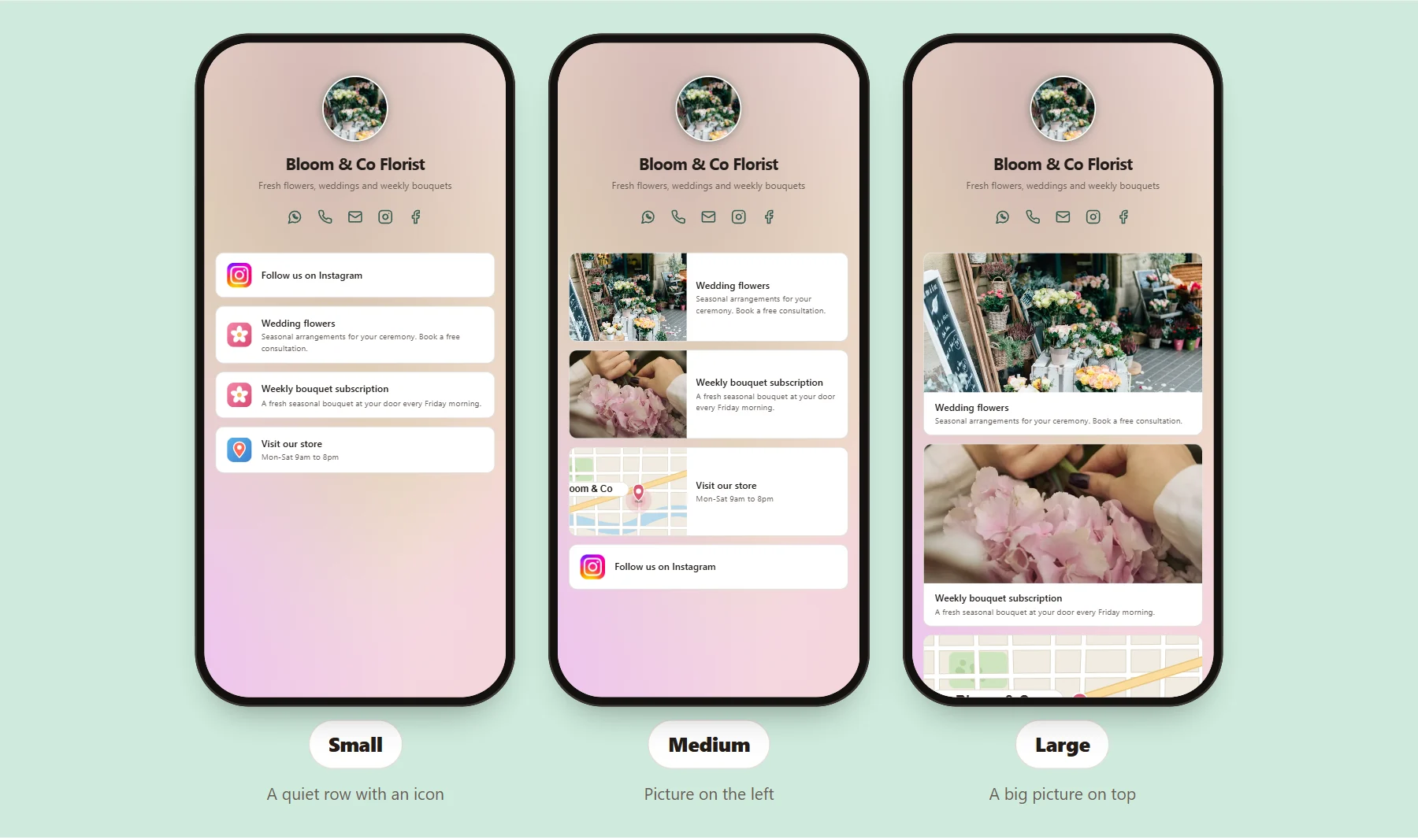
One page, three sizes: Small (a clean row with an icon), Medium (a picture on the left) and Large (a big picture on top).
- Small is a clean row with the linked website's own icon. It is right for social profiles, your email, a portfolio and anything a visitor might want but you don't need to push.
- Medium adds a picture on the left and a short description. It suits an offer, a product or a guide: something worth a second look.
- Large puts a full-width picture on top. This is your main action. Use it for one link, maybe two.
The rule I follow on my own page is simple: lead with one Large link, back it up with Medium links, and keep the rest as Small rows. A visitor can tell in under a second what the page is for and where to tap, which is the whole job.
The pictures come from your own upload or from the linked page itself, so a link to your shop can show your shop and a link to your store can show a map. You can see every size working on example pages in our free Linktree alternative page, and on a live example page.
Bigger Does Not Mean Louder
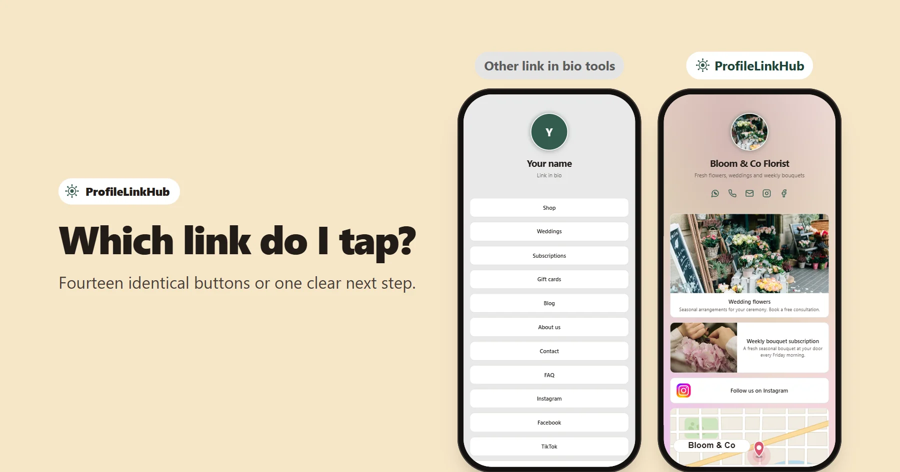
A common worry is that bigger links will make the page feel pushy. In practice the opposite happens. A clear hierarchy feels calmer, because the visitor is not working. Compare the two phones at the top of this article: the plain list looks tidy, but it asks fourteen questions. The picture-led page asks one.
It also helps to set the page up as a small funnel, the way you would any landing page:
- Attention: a clear name and a one-line sub-header that says who you help.
- Interest: one Large link with a picture and a one-line promise.
- Action: the tap itself, to a booking, a shop or a signup.
- Everything else: Small rows, below the main action.
Check Whether Your Page Is Working
Don't guess. Look at your numbers. In ProfileLinkHub's analytics you can see page views, link clicks and clicks by link, plus which source (Instagram, LinkedIn and so on) sent each visit. Two figures tell you most of the story:
- Clicks per view. If many people view the page but few tap anything, the page is not showing them where to go.
- Clicks by link. If your most important link sits near the bottom of the ranking, give it a bigger size and a picture, then watch whether it moves.
Change one thing at a time, wait a week, and compare. If you want to set up the basics first, see how to create your link in bio page, or compare other tools in our guide to the best link in bio tools in 2026 and the best free Linktree alternatives. If your main worry is fitting everything behind one URL, here is how to put multiple links in one link.
Why I Care About This
I've spent 20 years building SaaS products and conversion funnels, and the question underneath all of that work is always the same: why do people who want what you offer still leave without taking the next step? Most of the time the answer is not the offer. It is the page in front of it. A link in bio page is the smallest and most overlooked page in your funnel, and it is often the first one a new follower sees.
If you use LinkedIn, the same rules apply to the link behind your LinkedIn link in bio, where a visitor is often deciding in seconds whether you are worth following up.
Try a Page That Tells Visitors Where to Click
You can start free and build your page. Every feature, including all three link sizes, is included in the 30-day trial, and you can see what comes after on the pricing page.
Frequently Asked Questions
Can a link in bio really lower conversions?
Yes. A page of identical buttons gives visitors many equal choices and no clear next step, and people facing that often tap nothing. Putting one main action first, in a larger size with a picture, gives them a clear path.
How many links should a link in bio page have?
There is no magic number, but fewer is better for the main action. Lead with one Large link, add a few Medium links for your next most important offers, and keep everything else as Small rows so it stays available without competing.
What are the three link sizes in ProfileLinkHub?
Small is a clean row with the website's own icon, Medium puts a picture on the left, and Large puts a full-width picture on top. You pick the size for each link and can change it at any time.
Which link should be Large?
The one that earns you money or moves you toward your goal: a booking page, a shop, a signup or your newsletter. If you have two equal priorities, make both Large, but not more than that.
How do I know if my link in bio page is working?
Check clicks per view and clicks by link in your analytics. A low share of visitors who click anything, or your main link sitting near the bottom of the click ranking, both point to a page that is not guiding visitors.
Is ProfileLinkHub free to try?
Yes. You can start free, with every feature including all three link sizes included for the 30-day trial. See the pricing page for what comes after.